Greenbowl
Explore my case study about an organic pet food preview app. This case study was a part of my Google UX UI certificate program.

Greenbowl – Mobile App
This mobile application provides pet owners with personal and healthy meal options for their loved ones on the go.

Greenbowl – Desktop App
The desktop application provides pet owners with healthy and personal meal options and gives the user a platform, provided food stories and informations about animals.
Greenbowl – Mobile App Part 1


The Product
Designing a organic pet food ingredient
preview application for mobile
The Problem
I wanted to optimize the time consuming
online search for pet owners who want to
have healthy pet food and knowledge about
the best food they can give to their pet.
The Goal
Was to create a platform, where pet owners
can not only buy and find the information of
the best organic nutrition for their pets but
also create an accounts and system to reorder
quickly when food is running out.
My Role
UX designer, UX researcher
My Responsibilities
User research, Wireframing, Prototyping


User Research
In the beginning I assumed, that most pet owners have difficulties finding the most perfect and
healthy food for their pet in short time, because I made that experience too. So, I wanted to
conduct a research study about how much time the user needs to find good food and how many
times the user searches for new pet food and if there is a need for another healthy pet meal
platform.
Pain Points
Having a hard time finding healthy and non allergic food. Often need to change pet food due to the pets intolerances. In the shop the user uses most frequently, exists only unhealthy pet food and mostly no proper information about the ingredients. Ingredient previews are too superficial and do not provide further information about the food and the pets needs.
Persona
Samuel loves grumpy, his cat dearly and wants
to have the best food for him, so the cat has a
long and healthy life. Therefore he needs to have accessible information of the food he buys for his cat.
User Journey Map
I created a user journey map of Samuels experience
using the site to help identify possible pain points and improvement opportunities.


Sitemap
My goal was to make strategic information architecture decisions that would improve overall website navigation. I wanted a simple and easy navigation.
Paper Wireframe
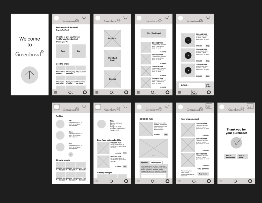
First I sketched out some wild paper wireframes for each screen in my app, keeping the user pain points about navigation, browsing, and checkout flow in mind.
Mobile Wireframe
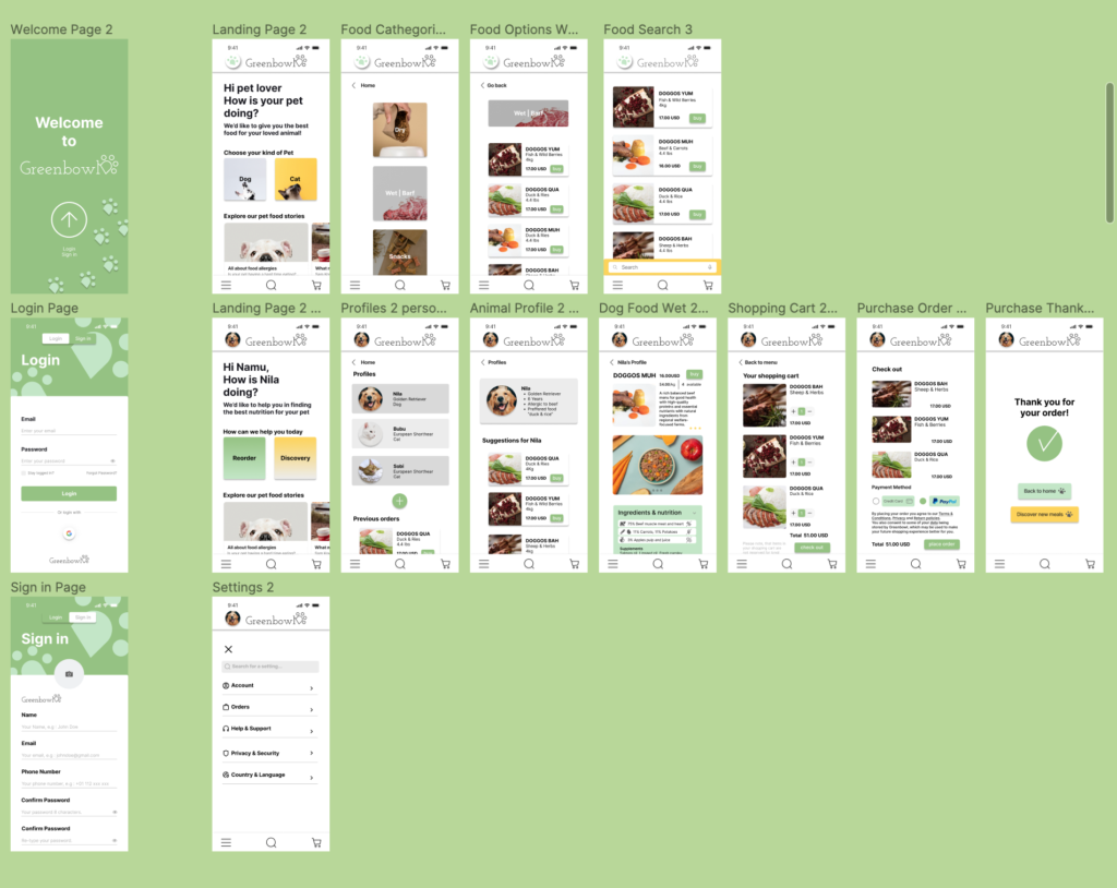
I wanted to create an easy and interactive platform for pet owners, so they can find healthy and best-suited food for their pets and shop for meals as quickly as possible while on the go. If they have spare time during their commute or enjoy educating themselves in general, they can enjoy an informative reading experience with stories about pet food.


Usability study & changes on prototype
I conducted a 20-30 minute unmoderated usability study in Switzerland/Basel with 6 participants.
Users provided feedback that meal ingredients and other information were hard to read. They were unable to find their favorite food again or discover suitable new, healthy options for their pets. Users also expressed a need for a simple, straightforward checkout process without confusion.
Greenbowl – Desktop App Part 2

Desktop Wireframe
The desktop version of the Greenbowl app is focusing on a platform where you’ll find brought information posts about pet food and of course find the right meal for your pet. You can store your preferences and recent products and are able to get suggestion accordingly.


Desktop Mockup
On of the insights of the usability study revealed that it was not clear how the index with the meal information
should work for the user. I changed it to a more interactive way, so you could see what information you are reading at the moment. The other input was, that there was no unit and amount information visible, so I added it.
Accessability
I used headings with different sized text for clear visual hierarchy.
I designed with accent colors and high contrasts.
